 |
 |
|
|
8th grade |
| |
|
If you see a button on the description, there is a lesson plan or rubric linked.
|
|
|
Portraits/Painting Study This 8th grade unit is a study in positive/negative space, and contrast. We do a study in color before this lesson. I did this lesson in my art room with just 2 computers and Adobe Photoshop. While working on another lesson, students took turns taking digital pictures of each other, downloading into Adobe Photoshop and manipulating the Contrast of their portrait. They changed the size of the picture, printed them out and enlarged them. We put them on watercolor paper and painted them with tube watercolors. |
|
Where is the Fire? We start the year with this unit because it includes many drawing techniques. The other art teacher and I went and took pictures of fire hydrants around town. Students selected a picture and did a contour drawing, filling the page. They then divided the paper into four sections and applied several different drawing techniques. We studied color schemes, contour drawing, value with shading, pointillism, negative line. In one background area we designed patterns. This lesson is adapted from a School Arts issue. |
|
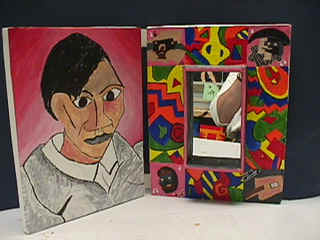 |
Reflections of an Artist The 8th graders started by researching artists. I gave them an index card and had them list 10 facts about the artist and fill out a worksheet. The students used Art and Man, the web, and files I've made on artists over the years. They then wrote an essay on the artist. The main concept here was to create a bi-fold, with the artists portrait on one side and the other side holds a mirror to reflect the artist, double meaning intended, and each corner must contain a different element from 4 different pieces of art from the artist. The rest of the border on the other panel had to be an element that is repeated to show unity. On the inside of the mirror the students wrote a quote from the artist. |
|
Decorative/Pattern/Slab The students were asked to create a slab design, three-dimensional. They built a mock-up out of tag board first. The piece must contain texture incised or impressed. They needed to design it so that it made someone want to turn it around to view all the sides. When it came to glazing, they had to have repeating designs and limited color. |
|
|
|
Clay Shadow Box/Poem My Art Partner, Cindy Petersen designed this unit. The students wrote and illustrated poems. This person had to create a poem with the letter C since his name starts with C. His poem contains things he enjoys and descriptions of him that also start with C. He then created a shadow box, in clay, with elements mentioned in the poem. Some students divided their shadow box into sections and others did not. They were very creative. |
|
Sculpture/ Color Unit The artists we studied for this unit were Frank Stella and Jackson Pollock. The students took 3 pieces of large tag board, decided on a color scheme and did layers of painting, by taping off areas and stenciling. We discussed patterns and repetition. Each painting needed a focal point. They looked at their paintings and chose a theme or concept to express for the rest of the assignment. We next cut apart our paintings anyway we wanted and made reliefs by gluing our cut pieces on to cardboard for strength and re-glued our paintings into layers. This one was based on the theme that we have a direction we aim for then we come across an intersection that we have to decide what direction to go and some choices have a tornado effect. This was an awesome assignment, but I had a small class. |
|
|
|
Metamorphosis This unit is to see how creative my students are. I assign them a letter and they have to morph the bubble letter to an object that starts with that letter. I grade them on originality for the changes, difficulty in execution, neatness, equal space between steps, conformity in steps and equal amount of change for each step. The top example is a L to a lama and the second is a F to a frog. morphing information sheet with links
|
|
One Point Perspective Floating Objects The students studied one point perspective. Vocabulary consisted of vanishing point, horizon line, parallel lines, forms and convergence lines. They had to create an object to intertwine through the forms. The medium used is colored pencil. This lesson was taken from the internet, from another teacher. I can't remember the source. |
|
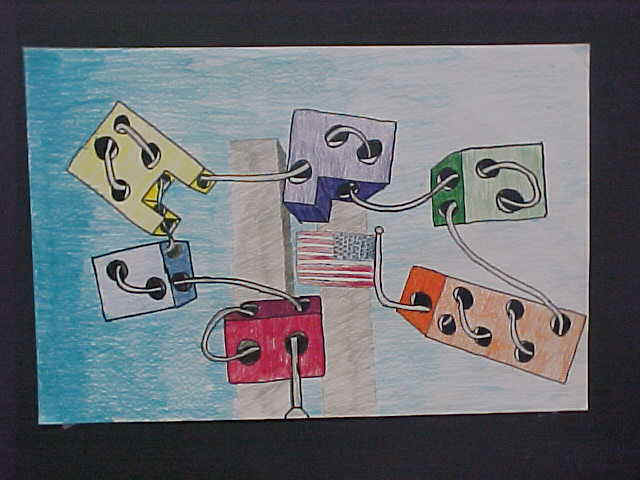 |
The student did this piece after September 11th. The Twin Towers of the Trade Center Peek out at you from behind. |
|
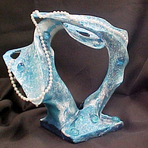
Wire/ Hose Sculpture This lesson was off of a CD called Oodles of Ideas, from Carolyn Roberts and Bunki Kramer . We started the lesson with a study of surrealism and sculpture. We discussed non-objective design also. The forms were built using hangers and pantyhose. Then we painted and added other materials to them.
|
 |
|
|
|
|
|
Surrealistic Hand I think this lesson was off of a CD called Oodles of Ideas, designed by Bunki Kramer and Carolyn Roberts. The students studied surrealism and we focused in on the work of Rene Magritte, Salvidor Dali, Giorgio de Chirico. We did this assignment in conjunction with the wire hanger sculpture, while we waited for coats of paint to dry. |